It’s truly a treat to share illustrator Dow Phumiruk’s process for HER NAME WAS MARY KATHARINE: THE ONLY WOMAN WHOSE NAME IS ON THE DECLARATION OF INDEPENDENCE! If you haven’t shared this book with kids in your life yet this year, it’s a must read! I love seeing it alongside REVOLUTIONARY PRUDENCE WRIGHT and CLOAKED IN COURAGE in book recommendations for children to celebrate the 250th anniversary. Three mighty women we should all know about! HUZZAH!
GIVEAWAY!! Leave a comment below for a chance to win your very own copy of HER NAME WAS MARY KATHARINE: THE ONLY WOMAN WHOSE NAME IS ON THE DECLARATION OF INDEPENDENCE from Dow!
Congratulations to Lynn B, the winner of SAY HELLO LIKE AN ARMADILLO from Zewlan Moor!
Illustrating Her Name Was Mary Katharine
by Dow Phumiruk
Did you know that there is a woman’s name on the Declaration of Independence? Mary Katharine Goddard was a trusted printer in colonial times and was tasked with printing copies of this important document. Her name is proudly displayed at the bottom. I’m so excited to talk to you about our book in honor of our country’s 250th birthday.
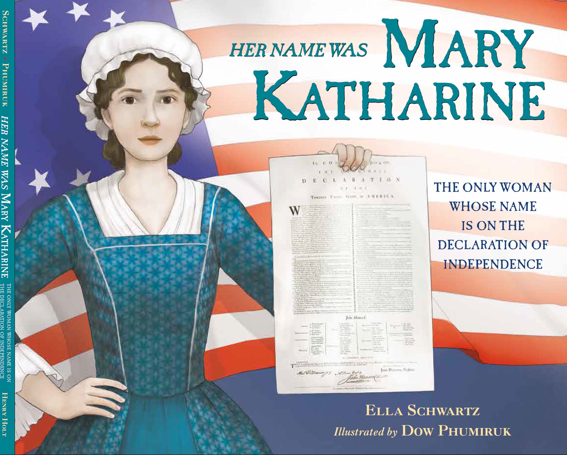
When I was offered this project, I was shocked that I had never heard of a woman who had served such a prominent role in our country’s founding. Her story needed to be told, and Ella Schwartz did a fantastic job writing it. She is super smart and diligent with research, and she is such a talented author. I am so grateful to our incredible editor Christy Ottaviano (Christy Ottaviano Books of Little, Brown Books for Young Readers) for pairing us together. What an honor it was to be part of this team!
Since the book’s publication, I have so enjoyed telling audiences about it. I start with the question I posed above. Then I proclaim that Mary Katharine Goddard should be a household name. I think you’ll agree when you read about her. I’m happy to share how I created the art for this book for this blog post.
Sketches
My drawing process starts digitally on Photoshop (though recently, I have been experimenting with sketching using Procreate on my iPad. I was inspired by author/illustrator extraordinaire LeUyen Pham, who presented at a local conference I attended and told us she always sketches on her iPad).
Planning compositions digitally means that I can easily reposition elements on the computer. I start with thumbnail sketches that are very rough. This is my storyboard. I draw blobs! This is a very messy but crucial initial step. I can lay the text out for each spread if the text has not been paginated yet. I think the storyboard is truly one of the most important steps to get right. It takes careful planning to decide what to draw on each page, and I try to vary layouts and perspectives with each page turn. The storyboard is really just for my eyes (and for yours, today!). Behold its roughness!
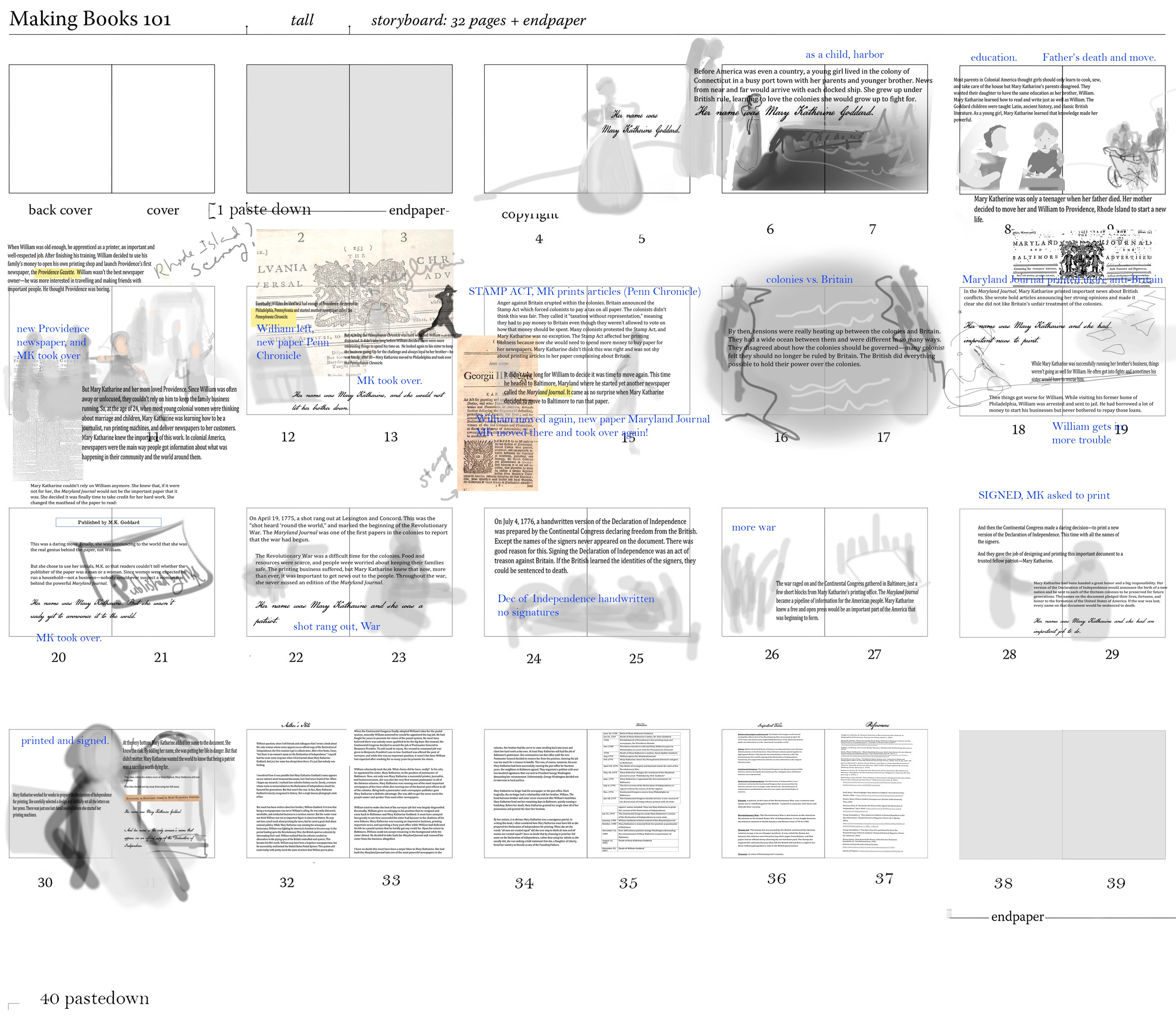
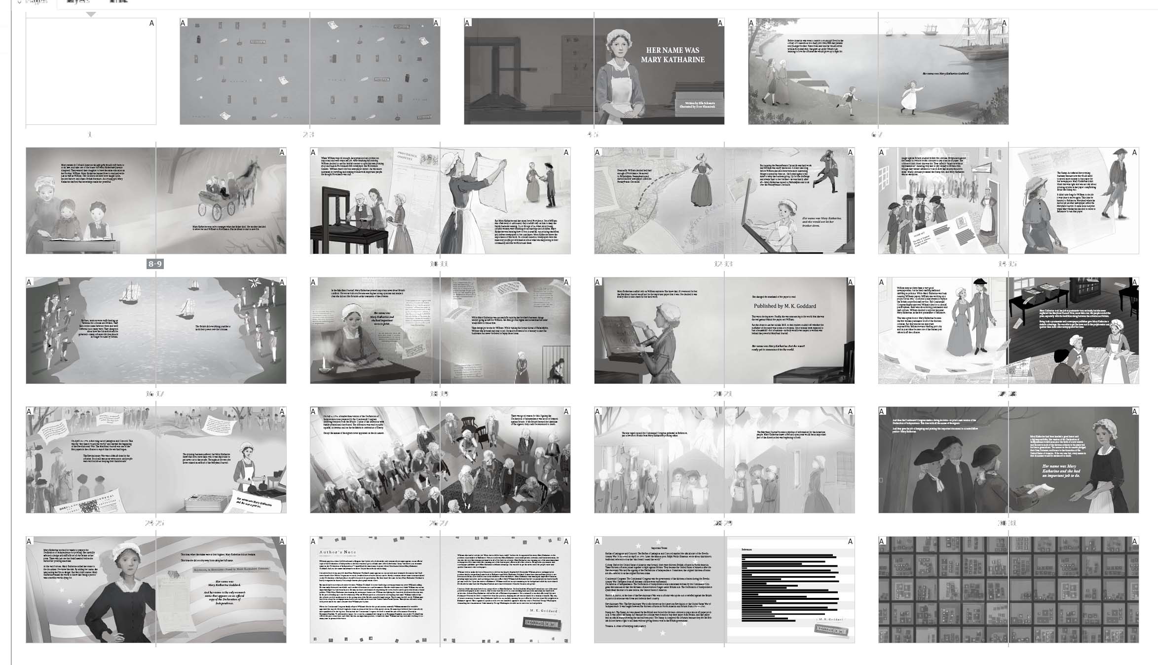
I then take each of the thumbnails sketches and start working on more detailed sketches for each spread. This is the version I will submit to the publishing team. I add value (lights and darks) to the sketches. When I first started out as an illustrator, I went straight to color. But now, I see the utility in a value study. It is essential to help me lead the viewer’s eyes where I want them to look. I fuss with details a bit before finally sending it to the editor or art director for feedback. I’ve been so fortunate to have been paired with so many brilliant publishing teams. They always share astute feedback, which I try to incorporate into my revisions. Their careful eyes and thoughtful feedback elevate my work.
Once my revised sketches are approved, then I can move on to color – hooray! As I mentioned, I used to go straight to color, because I love color. But now I hold back (like a mature adult artist should, ha ha) and set up the image as well as I can before going on to this stage, which is when the art really comes to life.
Final Art
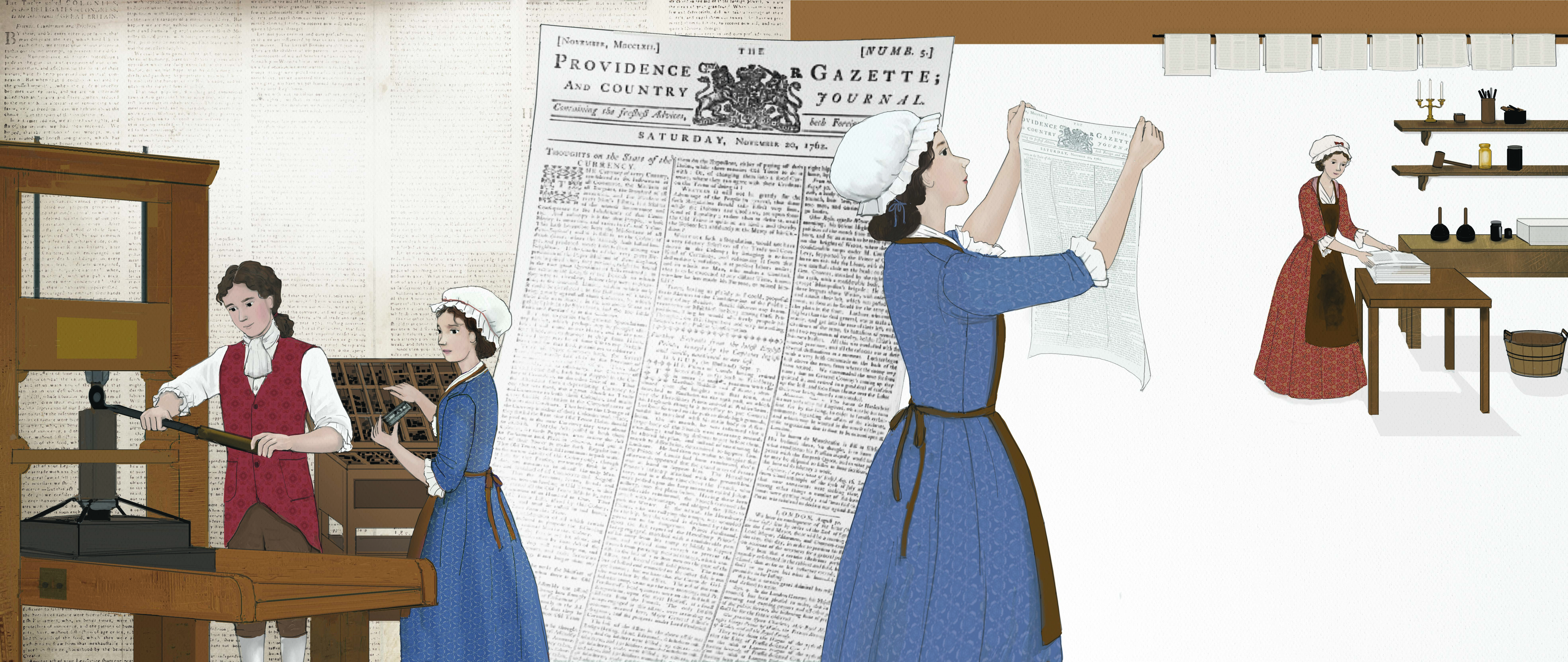
I work predominantly with Photoshop and a Wacom pen and tablet for final art. Along with the digital tools, I utilize pencil as well as other traditional media to collage into my art. For this project, I included newspaper samples as textural elements, too. I use an Overlay layer at about 30% opacity to subtly blend the textures onto the digital art. Ella shared images of the actual copies of The Maryland Journal (a newspaper Mary Katharine edited) with me. At the Library of Congress, she actually held pages printed so long ago by Mary Katharine herself! You can see how I used this as texture on the jacket image as well as on this interior spread, where I’ve collaged the newspaper print in the background.
When all the spreads are ready, I submit final art. I get more feedback and submit any final revisions. In addition to correcting any issues the publishing team points out, I often find more tiny issues on my own to correct, too. All issues are eventually addressed after a few rounds of proof prints (unbound, printed copies of the art to review). And then, I am done!
The team chooses text font and layout. They also choose the paper for the book. I love that the paper for this project is uncoated, which means it is not smooth and shiny. It adds a lovely texture to the pages, reminiscent of uncoated paper of the era.
Thank you for having me on the blog today, and I hope you’ll read about Mary Katharine Goddard!
GIVEAWAY!! Don’t forget to leave a comment below for a chance to win your very own copy of HER NAME WAS MARY KATHARINE from Dow! (US addresses only, please. Winner announced 7/3/26)
When you enjoy a book, please leave online reviews to support authors and illustrators. 😃

The illustrations are beautiful! Thank you for taking us step by step through the process.
LikeLiked by 1 person
So interesting to hear the process of making this beautiful book! Thanks for sharing, Dow and Beth!
LikeLiked by 1 person
”Like a mature adult artist”! Haha! Love your sense of humor in this post, Dow! I’m going to reread the post alongside the physical book for even more fun! Thanks, Dow and Beth!
LikeLiked by 2 people
I really enjoyed getting a look at your process Dow and I look forward to reading your book. Congratulations!
LikeLiked by 1 person
Beth and Dow, thank you both for a great interview post and a wonderful look into your process of creating the spreads of a PB. I adore your work Dow and love the colors and newspaper collage additions! I can’t wait to get a hold of this book as I really enjoy Ella Schwatz’s writting as well. This one looks amazing. Thanks Beth!
LikeLiked by 1 person
I love this book! Fascinating to learn how the illustrations came to be. People should know about Mary Katharine and I hope this story reaches many readers.
LikeLiked by 1 person
Thank you for sharing your progress. This is a great book that every school library should have!
LikeLiked by 1 person
Fascinating to learn about your process and look forward to reading this book.
LikeLiked by 1 person
Thank you for sharing your art process with us. I can’t wait to read this book–why doesn’t everyone know about this woman? I can’t wait to tell everyone about her.
LikeLiked by 1 person
A wonderful newsletter Shirley Strait
LikeLiked by 1 person
Really interesting, Dow! The value study sounds really helpful, when I paint, I go straight to color (the fun part) and figure out values later, but I’ve been trying to get better at that. Also, everyone knows about the Founding Fathers, we need to get more attention for the Founding Mothers!
LikeLiked by 1 person