I’ve been in a local critique group with Julie Rowan-Zoch for nine years (Oh wow, has it been that long!) and have had the good fortune to learn a lot of from her. It’s always fascinating to see another creator’s process, especially illustration, since it’s foreign to me. Here’s a great post from Julie sharing her newest book as an illustrator: NOT ALL SHEEP ARE BORING!, written by Bobby Moynihan.
GIVEAWAY! Julie is offering a signed copy of NOT ALL SHEEP ARE BORING! Just leave a comment below for a chance to win.
Congratulations to Jennifer Merrifield, winner of CLOAKED IN COURAGE from my post last week!

Composition 101 by Julie Rowan-Zoch
After accepting a book project, illustrators all have their own preferences and priorities for going about their contribution to the project, but most of what we contemplate is really quite similar to what authors consider in composing the text.
Let’s look at composition in illustration, the arrangement of different elements to complete an image: a spot, a scene, a spread, and the picture book as a whole. Let’s see if any of my brief descriptions of the following elements compare to how writers-only (I actually hate that phrase!) go about their business too.
Unity: we aim to have all the visual parts feel as if they belong together, even the focal points to which we want to draw the eye need to feel right amongst what surrounds them. While main characters should stand out, they still need to fit into their environment.
Balance: the visual weight of the elements on the page, between the positive and negative space, keeping the viewer’s attention at ease as well as intrigued.

Movement: the arrangement of objects/shapes and the lines all direct the viewer’s eye into and around the artwork on the page, hopefully from left to right (at least in most Western parts of the world), as this will also lead our readers to turn the page.
Rhythm: this probably doesn’t need explaining to the rhymers out there, but illustrators use things like shape and color to create tension needed for good page turns too!

Focus: we all want the viewer’s attention to fall on the most important thing on the page for emphasis, otherwise we may lose the reader’s attention.

Contrast: the area with the highest contrast will draw the reader’s attention, as mentioned under Focus, but often the images are not busy with strong differences between light and dark, but we can also use differences in shape, pattern, color, and even the type of line – something that works rather well with dialogue too!
Pattern: what picture book writer hasn’t used repetition? Illustrator’s use it too!

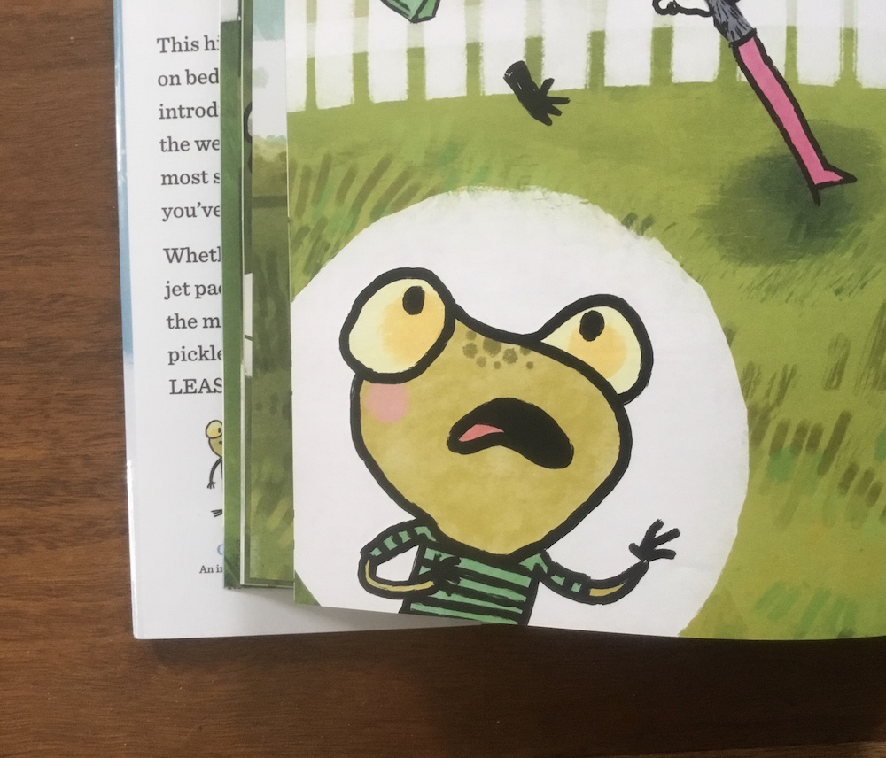
Proportion: how things fit together and relate to each other in scale and distance, and using it in exaggeration to emphasize – or minimize – an idea. (I used a white bubble to emphasize the narrator’s reaction in balance with the exciting content in this scene below.)
Do Wassily Kandinsky’s words ring true with your writing too?
“The composition is the organized sum of the interior functions of every part of the work.”
Don’t forget to leave a comment below for a chance to win a copy of NOT ALL SHEEP ARE BORING! (continental US addresses only, please. Winner announced 12/2/22.)

Kandinsky’s comment is relevant to writers also.
LikeLiked by 1 person
Yes! I enjoyed the comparison of writing and illustrating.
LikeLike
Thanks for letting me talk about one of my favorite things! Of course, I could go on, so let me know when I can come back! Hahaha!
LikeLiked by 1 person
You have an open invitation! Thanks for sharing with us!
LikeLiked by 1 person
What a cute idea for a twist on counting sheep because their nature of being regarded as “calm” will put you to sleep. Thanks for sharing your book with us!
LikeLiked by 1 person
This was superb Julie!
I hope if you do another post with Beth you might share something about pagination – whether you prefer to have the editor send you manuscripts with or without, if you can decide to revise where page turns happen in a story, etc.
Although I am always trying to write stories with plenty of humorous, visual elements, I am often surprised (delightfully) at which ‘scenes’ are illustrated or not in the final art!
Cheers!
LikeLiked by 1 person
Wow, I learned so much. I knew illustrator’s have their own process, but this is the first time I’ve heard it explained so I could understand it. Love the balance, color and placing. Look forward to reading this gem. And kids are going to love the “silly” in the story.
LikeLiked by 1 person
Wow, Julie! I admire your talent/skill and your ability to pull all these things together in your head. I have little to no skill in creating design, so I appreciate you walking us through the process. I do think that book design is a whole art unto itself. Thanks for sharing your knowledge with us!
LikeLiked by 1 person
THANK YOU! I THOUGHT THAT SAGE ADVICE. I’D LOVE TO WIN A COPY OF NOT ALL SHEEP ARE BORING!
LikeLiked by 1 person
I LOVE this post! Who knew that I could understand ANYTHING about the illustrator’s process? But you explained in a way that a non-artist can grasp. Now I will notice new things about the art as I read picture books. I’d never heard of Wassily Kandinsky but his words definitely ring true. Thanks Julie and Beth!
LikeLiked by 1 person
What a fantastic post, Julie! It’s the most concise explanation of composition elements I’ve ever seen and I love how you tie it all in with how to keep a reader hooked. Your characters in NOT ALL SHEEP ARE BORING are absolutely adorable (even boring Steve).
LikeLiked by 1 person
As the mother of an artist, I love reading posts such as yours, Julie. Picture book artistry is an art.
LikeLiked by 1 person
What an interesting breakdown for the illustrations. Thanks for sharing!
LikeLiked by 1 person
Hello Julie and Beth: Thanks so much for the insightful art and writing comparison post. Loved the coffee drinking sheep.
LikeLiked by 1 person
I know I’m too late to win this cute book, but just wanted to pop in and say thanks. Great other an illustrator’s perspective.
LikeLike