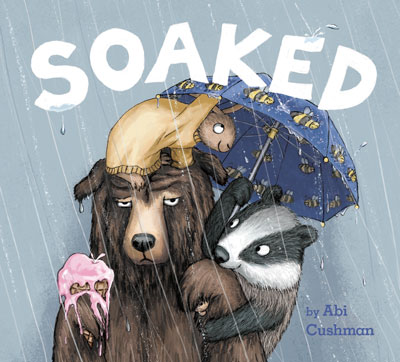
I loved the cover of SOAKED! from the moment I saw it! And now we get to hear the story behind it. It’s fascinating to see the effects of changes in expression, composition, and color. Thank you, Abi Cushman, for sharing the process of creating this fabulous cover!
AND….ABI IS OFFERING A GIVEAWAY! JUST LEAVE A COMMENT BELOW THE POST TO BE ENTERED TO WIN A COPY OF SOAKED!
The winner of last week’s giveaway of Wild Style is …Nora Nickum!

In traditional publishing, a book cover has to be approved by an art director, an editor, the sales and marketing department, and the publisher. That’s a lot of eyes on it, and a lot of pressure to get it right because well… everyone judges a book by its cover!
So I’m going to share with you the steps I took with Jim Hoover (art director) and Tracy Gates (editor) at Viking Children’s Books to create the cover art for my debut picture book, SOAKED!
When we first got started, Jim, Tracy and I all agreed that the cover should highlight the bear’s complete and utter misery in the rain and allow the playfulness and humor of the book to come through. Because you know… we’re jerks who like to laugh at sad bears.
I had always pictured the cover being a closeup of the bear’s face on a grey background, so I did a few rough sketches of Bear with different expressions.

Since the book was entitled, SOAKED, we decided against the ones where the bear wasn’t completely drenched. Jim did a quick mockup of the cover with one of my finished interior pieces of Bear so we could see what it might look like in full color.

After seeing it, Tracy worried about a grey background being too drab and the cover coming across as too negative. There wasn’t a ton of storytelling going on here either.
In the next version, I drew in a couple of Bear’s friends to keep him company. That seemed to brighten things up a bit. I also tweaked the background color to make it more of a blue-grey.

The storytelling was better here and the blue tint definitely helped, but Jim and Tracy thought we could give it even more pop.
Based on their suggestions, I did a few more sketches that bumped up the composition and made it more dynamic. We were getting closer.

Jim and Tracy preferred the bottom three samples but suggested making Bear’s expression in the last sample a little bit less like The Rock.

Yep. It was definitely hard to unsee that after it was pointed out. After a little tweaking, we had a winner!

Once I started on the final colored art, I decided to add the ice cream cone back in on the left for another punch of color to balance everything out.
For the title, we all agreed a hand-lettered title would look best, but I wasn’t too confident in my hand-lettering skills. Jim encouraged me to give it a try anyway, and I realized that hand-lettering is just a skill that takes some practice, no different from learning to draw umbrellas, puddles, and hula-hooping moose.
The cover was looking pretty good at this point… or so I thought. BUT! There was still more to do (of course). Jim wasn’t done experimenting with fonts on the interior spreads yet. Once he decided on the final font, he updated my byline font on the cover to match.
Then, they passed the cover by the sales team at Penguin Random House. The sales team loved the cover but suggested adding an exclamation point to the title. So I rearranged the letters to fit in the exclamation point, and after seeing it with the added punctuation, I do believe they were correct!
Finally, the production team at Penguin Random House adjusted the colors to get it ready for printing. And at long last, we had the final cover!

Looking back at the process, I am so thankful for the collaboration with Jim and Tracy. Their experience and expertise were key to pushing the cover to its full potential. It can be tough when you think you’re all done with a piece of art, and then people say, “Actually, it’s not quite there yet.” But if you’re getting feedback from people who know what they’re talking about, the end result is so much better. I’m really proud of the cover of SOAKED!, and I think we achieved our goal. Bear’s misery definitely shines through, and we only feel a little guilty about laughing about it.
Don’t forget to leave a comment to be entered to win a copy of Soaked! Drawing 8/28. Continental US addresses only.

Great reminder for all of us about the need to iterate and enjoy the rain.
LikeLiked by 2 people
Yes!
LikeLike
This is a wonderful “behind the scenes” look at the process that a visual artist goes through when creating a design for a book cover. It requires imagination, hard work, and a keen eye for detail.
LikeLiked by 2 people
I love learning about what goes into the cover and how different eyes see different things.
LikeLike
Love this cover and the insight into the process! Definitely makes me want to pick it up and read.
LikeLiked by 2 people
After I learn about what went into it, I notice so much more.
LikeLike
I’m always amazed by illustrators. And you’ve made it clear why, Abi! All the best to you!
LikeLiked by 2 people
Fascinating process! Thanks for stopping by!
LikeLike
❤️ Thanks, Donna!
LikeLike
First time I’ve read about the process of creating the cover! So many helpful eyes. And in the end, perfection. It is amazing how adding the exclamation point really made the cover stand out. Love the expressions on all of the animals faces. Thanks for sharing!
LikeLiked by 2 people
Those faces really got me! And I agree – those little details make so much difference.
LikeLike
So helpful! I’m so grateful it was a team effort.
LikeLike
Ha ha! The Rock gif made me giggle. Love the book Abi – thanks for the cover tips!
LikeLiked by 2 people
Thanks for stopping by, Cathy!
LikeLiked by 1 person
Haha thanks! Yeah I laughed when it was pointed out to me that Bear was making that face.
LikeLiked by 1 person
I love how the cover turned out! Great interview!!! Can’t wait to read this book to my firsties!☔💧💧☔
LikeLiked by 2 people
I predict they’re going to love it! 😍
LikeLike
Thanks, Julie! ❤️
LikeLike
Thank you for sharing this process! I so appreciate a creative mind. The final cover selection is one I can really relate to, especially the ice cream cone melting in the rain. Well done!
LikeLiked by 2 people
So interesting! 🤔
LikeLike
Thanks, Karen!
LikeLike
This is a fascinating process, a combination of art and psychology.
LikeLiked by 2 people
Exactly! well said!
LikeLike
Yes, definitely!
LikeLike
Great post – love how she came up with the cover. (psst – don’t add me to the drawing!)
LikeLiked by 2 people
I love hearing about the illustration process!
LikeLike
So fun to see the process!
LikeLiked by 2 people
I totally agree!
LikeLike
I love it! Thanks so much for showing the process.
LikeLiked by 2 people
Thanks for stopping by!
LikeLike
I thoroughly enjoyed the previous glimpse you provided into the writing process behind Soaked! but I had no idea that so much time, effort, and thought went into the cover art alone. When I consider, though, how many times I have decided for or against giving a book a chance based on nothing more than my initial impressions drawn from the cover, it really should come as no surprise. Thank you for drawing back the curtain!
Neil Bowers
San Diego, California
LikeLiked by 2 people
So true! Titles and covers are so hard – for a reason 🙂
LikeLike
Yes, I think the cover is the book’s number 1 marketing piece. (But now that I’m about to do the cover for my second book, I’m trying really hard not to think about how important it is. 😉 )
LikeLike
Such a cute book. And love the cover. It draws you right in!!
LikeLiked by 2 people
I enjoyed learning about the many revisions you needed to make before arriving at the final cover design. Another great example to share with students about the importance of revision.
LikeLiked by 2 people
Yes – what a super lesson to share with students on real-world revision!
LikeLiked by 1 person
Yes!! It’s all about revision. And in a way, it’s comforting to me. I know that it’s part of the process and we will get there eventually!
LikeLike
It’s always incredible hearing how the process for making a book is so long. I think it’s important to share with kids that there are so many people and attempts that help make a book ready! We love this book and thanks for the chance of winning!
LikeLiked by 2 people
I’m so thankful that I got to work with such a great team. (But yes, it’s always a super long process. 😂 )
LikeLike
Wow! Just wow! I admire illustrators soooo much! Congrats on making it through with a cover that’s outstanding!
LikeLiked by 2 people
Thank you, Jilanne!
LikeLiked by 1 person
This is such a fantastic book to use in the classroom. A great message for children and adults alike.
LikeLiked by 2 people
What a great book. Would love to share with students. Thank you for the opportunity
LikeLiked by 2 people
Ohhhh, I love the story behind the story! Many congratulations to you on this beautiful book!
LikeLiked by 2 people
Thanks, Linda!
LikeLike
Illustrations are just gorgeous! I would love to share this with my kiddos. Hopefully, in person! 🤪
LikeLiked by 1 person
Thanks, Jennifer!
LikeLike
As someone who draws stick figures, I had to see how you made this incredible book. Happy sale to both of you!
LikeLiked by 1 person
This looks like a fantastic book! The illustrations are so inviting!
LikeLiked by 1 person
Wow, way to hang in there and keep shuffling and tweaking. You came up with a great cover!
LikeLiked by 1 person
Thanks, Deb! I appreciate it!
LikeLike
I love this! Thank you for sharing!!
LikeLike